web design
web design
CLEANING BUSINESS WEBSITE

project overview
Pure-A Plus is a new cleaning company entering a highly competitive market where many businesses offer similar services and present very similar visual styles. The website needed to communicate professionalism and reliability while helping the brand stand out from competitors and create a strong first impression with potential clients.
the challenge
As a new business in a saturated industry, Pure-A Plus needed a website that would quickly build trust and clearly communicate the value of their services. Many competitors rely on generic visuals and predictable color choices, making it difficult for customers to distinguish one company from another. The challenge was to create a design that felt both professional and distinctive, allowing the brand to establish a clear presence in the market.
the solution
A clean, modern website was created to reflect professionalism while introducing a fresh visual direction through a pink and blue color palette. This combination helps the brand feel approachable, memorable, and different from competitors, without losing credibility. The layout was designed to clearly present services and guide visitors naturally through the content, creating a strong first impression and supporting the company’s growth in a competitive environment.
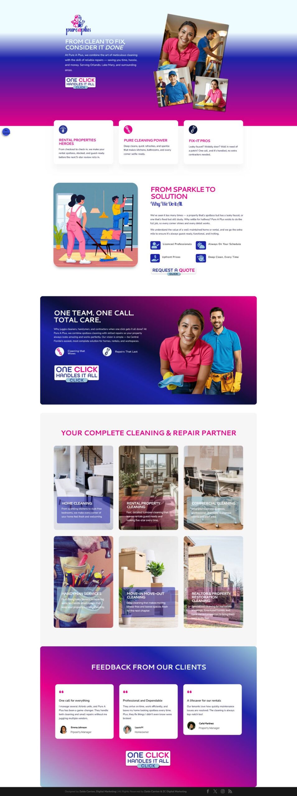
home
The homepage introduces Pure-A Plus as a complete cleaning and repair solution, communicating convenience and reliability from the first glance. The design uses a vibrant pink-to-blue gradient to create a distinctive presence in a competitive market, while clearly presenting services and guiding visitors toward requesting a quote. The layout emphasizes the idea of one team handling multiple needs, helping the company position itself as a practical and trustworthy partner for homeowners and property managers.
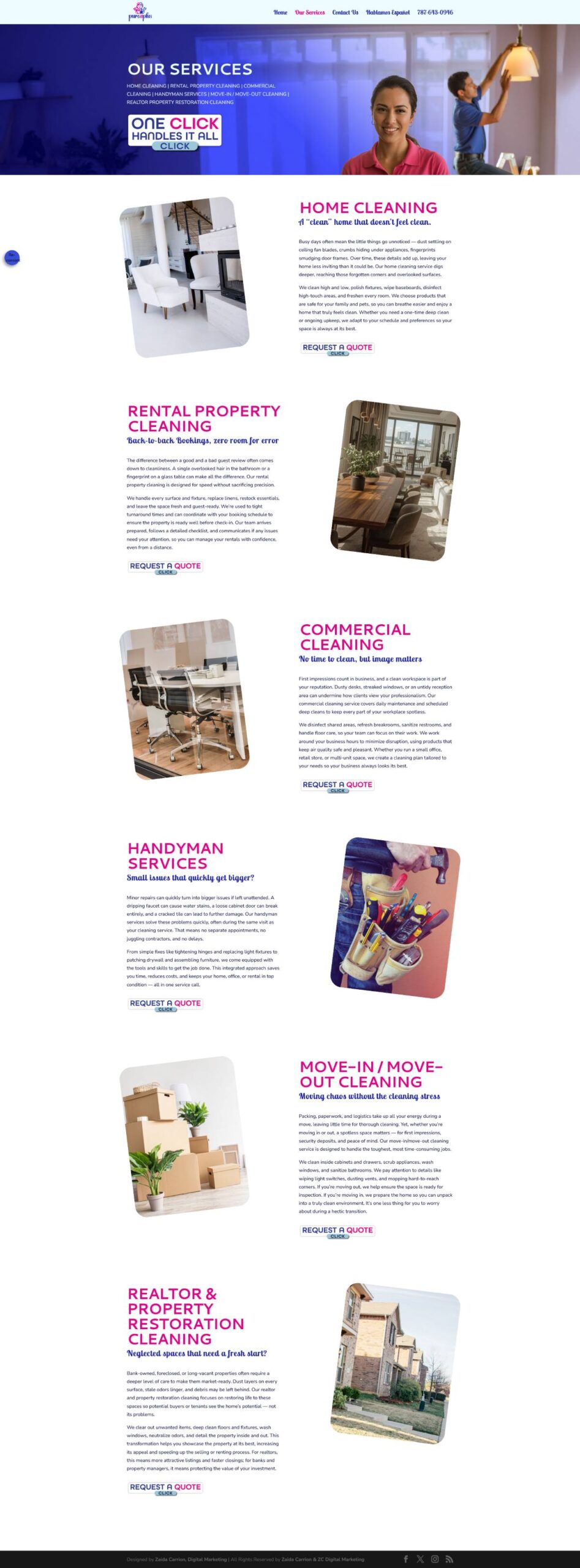
our services page
The services page presents the full range of offerings in a clear and structured layout, allowing visitors to quickly understand how Pure-A Plus can support different needs, from home cleaning to handyman services and property preparation. Each section highlights a specific service with concise descriptions and direct call-to-action buttons, helping users easily identify the solution that fits their situation. The design maintains visual consistency while reinforcing the idea of convenience through one trusted provider.
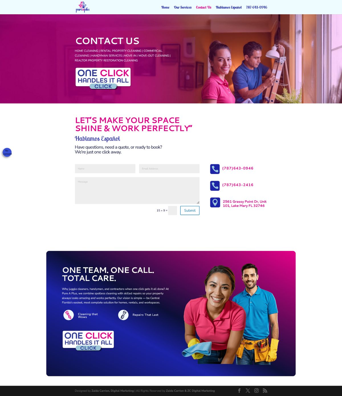
contact us
The contact page was designed to make communication simple and accessible, encouraging potential clients to easily request information or schedule services. The layout presents essential contact details alongside a clear form, allowing users to quickly take action. Consistent visual elements reinforce the brand identity while maintaining a friendly and approachable tone that supports trust and encourages inquiries.

let's connect