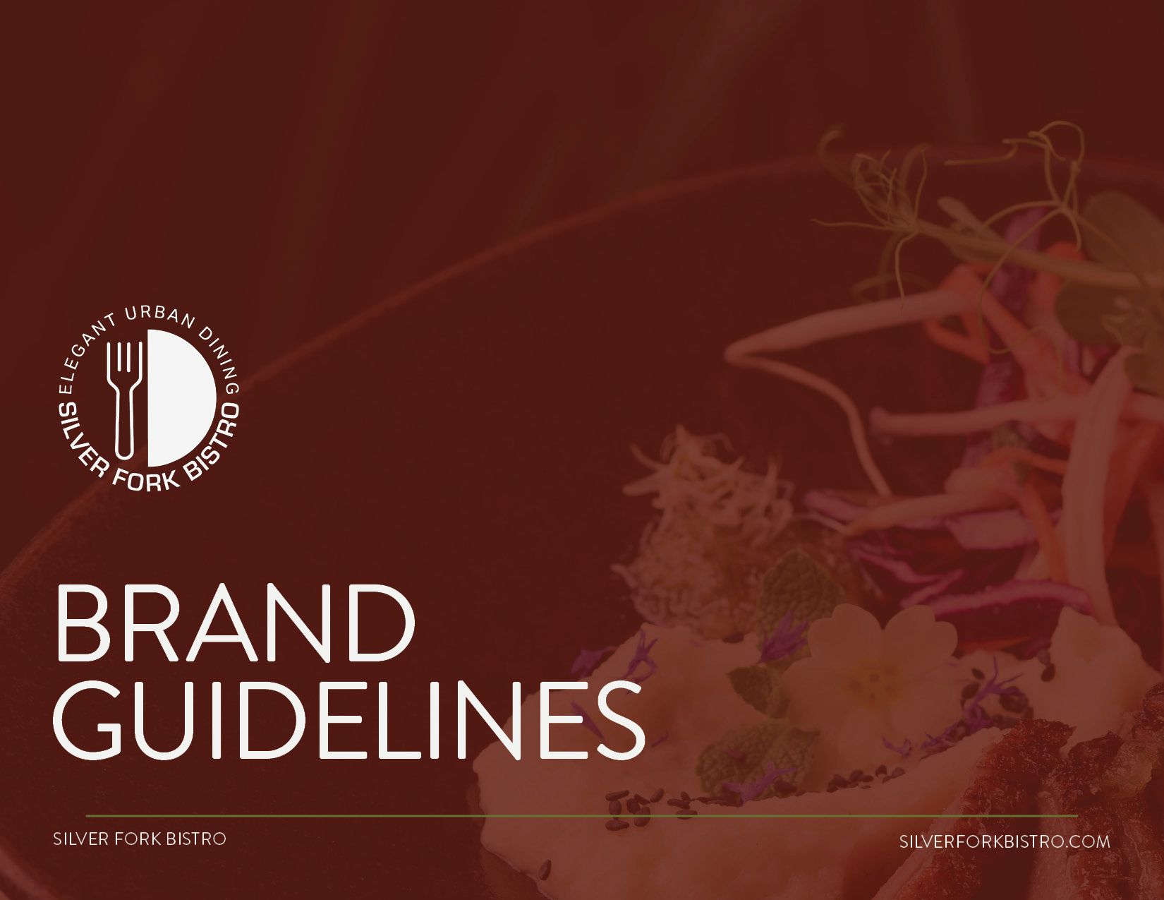
brand guidelines
brand guidelines
SILVER FORK BISTRO
project overview
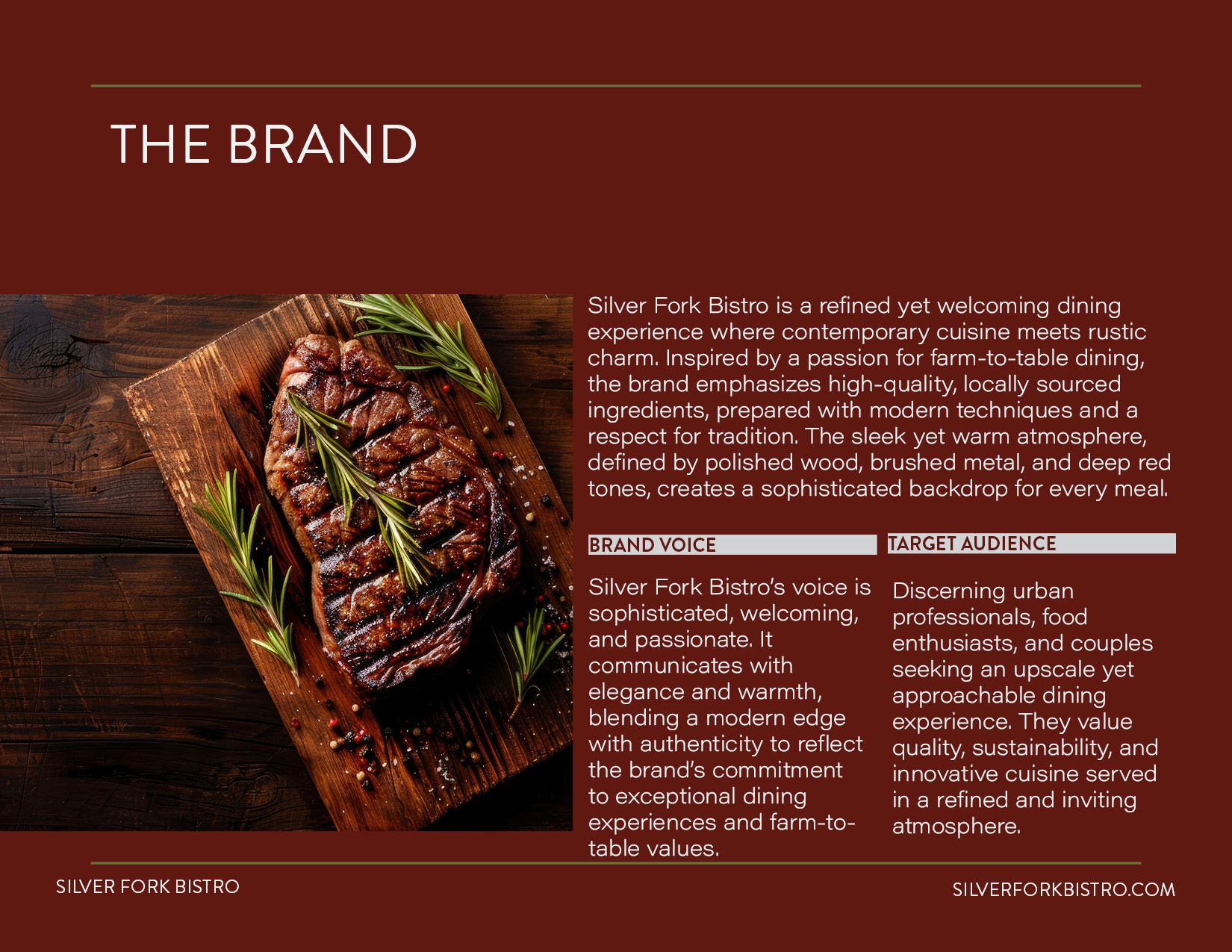
Silver Fork Bistro is a fictitious restaurant brand developed as part of the Adobe Graphic Design program. The project focused on creating a complete brand guideline system for an upscale bistro that combines contemporary dining with rustic charm. The objective was to simulate a real client process by defining the brand personality, audience, and visual direction, resulting in a cohesive identity that reflects quality and refinement.
the problem
As a new restaurant concept entering a competitive dining market, Silver Fork Bistro required a visual identity that communicated sophistication while still feeling welcoming and approachable. The challenge was to create a balanced brand that avoided appearing too minimal or too rustic, while still reflecting the idea of thoughtful dining and carefully selected ingredients.
the solution
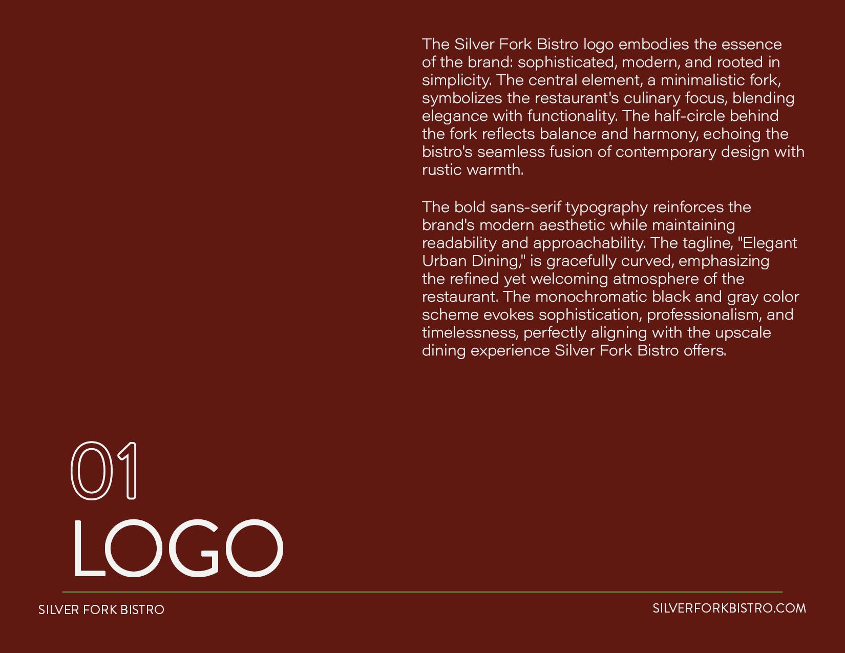
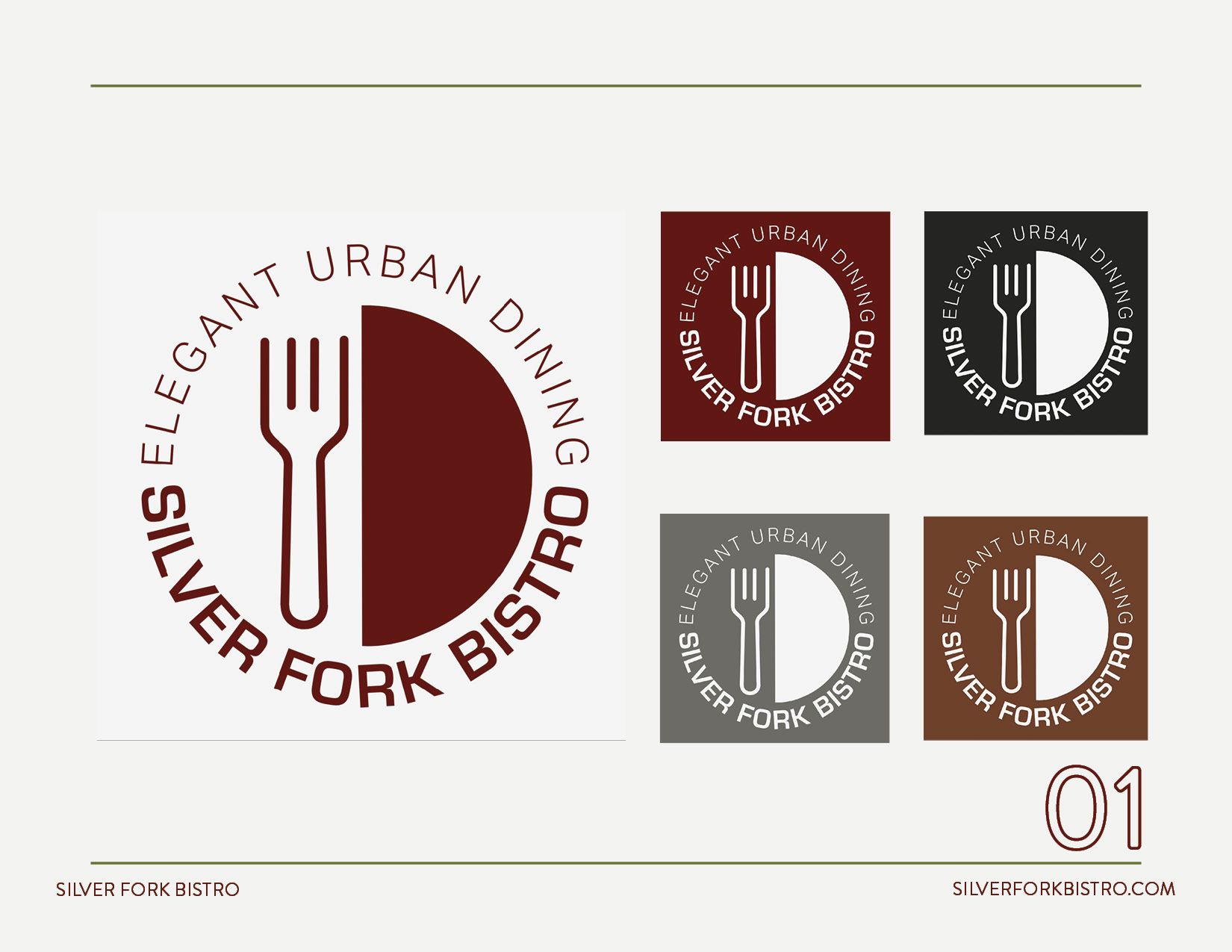
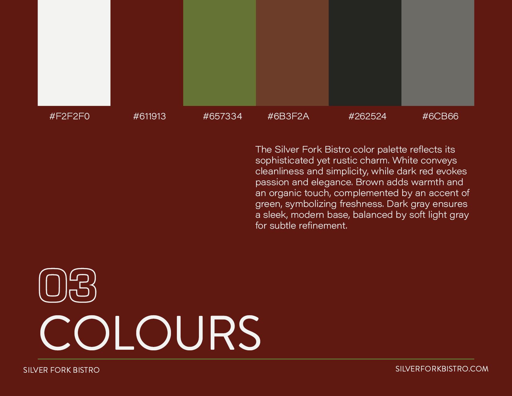
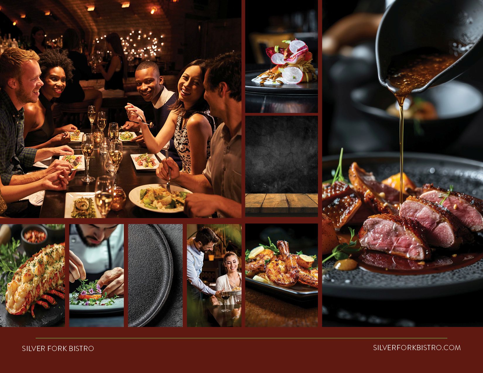
A complete brand guideline system was developed to establish a consistent visual direction for the restaurant. The logo uses a minimal fork symbol combined with balanced forms to represent elegance and harmony. A warm, earthy color palette was selected to communicate quality, craftsmanship, and a connection to natural ingredients. Clean typography supports clarity and readability, allowing the brand to feel refined without becoming overly formal. The guidelines demonstrate how the identity can be applied consistently across different touchpoints, including menus, stationery, and promotional materials.

let's connect
hello@zaidacarrion.com